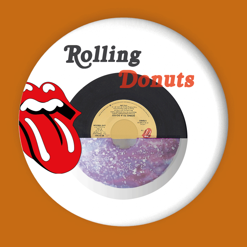
The Rolling Stones both as a band and a brand stand for a vintage,
80’s-pop-culture-heavy aesthetic. Donuts in my mind are like funk food-popping colors and everything. It hence only seemed right to give a donut its rightful representation- in a vinyl-record-like casing. Just to reinstate that funk.
Keeping up the design language is the glossy donut graphic and logo, and the classic font. Through the apt usage of the logo comes this crossover single donut packaging concept- the Rolling Donut,
in a cute compact round container- for those constantly on a roll.


Comments